Shortcode generator and styling options
You can make the switcher button match your theme without writing any CSS (the code that styles web pages). The Shortcode tab builds the shortcode for you: you flip toggles and pick colours, watch a live preview, then copy the result. For example, a store with a dark header can give the button a dark background, light text and rounded corners, then paste one line into the header.
How it works#
The look of the button comes from three places, and the most specific one wins:
- The plugin’s built-in look: a transparent button that takes its text colour from your theme, with a thin border.
- General > Switcher Button Defaults: site-wide defaults for the border and text colour. They apply to every
[wccs_switcher]that does not set those attributes itself. - Attributes on the shortcode: for example
bg="#0f172a". These always win over the defaults.
Build a shortcode with the generator#
- Go to WooCommerce > Currency Switch > Shortcode.
- Under Display, turn on the parts you want on the button: Show flag image, Show ISO code (USD), Show symbol ($), Show full name and Show chevron. The Preview updates as you go (hover states are not shown in the preview).
- Under Geometry, set Border Radius (px) with the slider (0 to 50), plus Padding and Button Font Size.
- Under Modal Text Sizes, optionally set the popup Title, Code and Name sizes.
- Under Colors, set Background, Text Color, Border Color, Hover Background, Hover Text and Hover Border. Use the colour picker, type a value, or click in a field and then click one of the variable chips (such as primary or white) to insert
var(--primary). - Click Copy next to the generated shortcode and paste it into your page, header or widget.
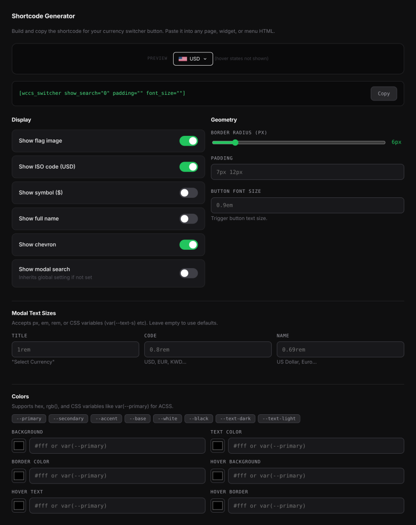
The generator only adds attributes that differ from the defaults, so the shortcode stays short. It also remembers your last choices in your browser, so you can come back and adjust them. Nothing on this tab needs saving.
The Show modal search toggle starts in the same state as Show search bar in modal on the General tab, so by default the shortcode follows that setting. Change it only when this one switcher should be different: the shortcode then gets show_search="1" (on) or show_search="0" (off).
Styling attributes#
| Attribute | Default | What it styles |
|---|---|---|
bg | transparent | Button background |
color | your theme’s text colour, or Text colour from the General tab | Button text and icons |
border_color | same as the text colour, or Border colour from the General tab | Button border. none removes the border. |
border_width | 1 | Border thickness |
border_radius | 6 | Corner rounding |
padding | 7px 12px | Space inside the button |
font_size | 0.9em | Button text size |
font_weight | your theme’s | Button text weight, for example 600 |
gap | 6px | Space between the flag, code and arrow |
hover_bg, hover_color, hover_border | same as the normal state | Background, text and border on hover |
title_size | 1rem, or the General tab setting | Popup title (“Select Currency”) |
code_size | 0.8rem, or the General tab setting | Currency codes in the popup |
name_size | 0.69rem, or the General tab setting | Currency names in the popup |
border_width, gap and font_weight are not in the generator. Type them into the shortcode by hand.
Accepted values: hex colours (#fff, #1d4ed8), colour functions such as rgb() and hsl(), CSS variables such as var(--primary), and sizes such as 8px, 0.9em or 1rem. A plain number for border_width, border_radius, font_size, title_size, code_size or name_size is read as pixels, so border_radius="8" means 8px. For safety, a value that contains characters such as ;, {, } or quotes is ignored, and the default is used instead.
Site-wide button defaults#
Set these once on WooCommerce > Currency Switch > General, under Switcher Button Defaults, then click Save Changes.
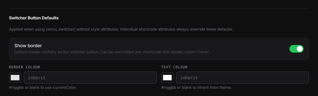
| Setting | Default | What it does |
|---|---|---|
| Show border | On | Shows a border on the button. Turn it off for borderless buttons everywhere. |
| Border colour | blank | A hex colour (#rrggbb). Blank uses the text colour. |
| Text colour | blank | A hex colour (#rrggbb). Blank uses your theme’s text colour. |
These defaults apply to switchers added with the shortcode. Any border_color or color attribute on a shortcode overrides them.
Examples#
A dark button with rounded corners:
[wccs_switcher bg="#0f172a" color="#f8fafc" hover_bg="#1e293b" border_radius="8" padding="8px 16px"]A button that uses your theme’s colour variables and has no border:
[wccs_switcher bg="var(--primary)" color="var(--white)" hover_bg="var(--primary-dark)" border_color="none"]A pill-shaped button with bold text and bigger currency codes in the popup:
[wccs_switcher border_radius="50" font_weight="700" code_size="15px"]Good to know#
- A CSS variable only works if your theme or framework defines it. If
var(--primary)is not defined on your site, that attribute has no effect. - Sizes set with
title_size,code_sizeandname_sizeonly change the popup of that one switcher. For all popups, use Modal Popup Typography on the General tab. - The popup’s highlight colour is not a shortcode attribute. Set it with Primary Color on the General tab.
Related docs#
- Adding the currency switcher
- Switcher popup design
- Adding the switcher to your menus